Chubb Access
This case study follows the design of Chubb access, a Chubb platform I design along with Senior UX designer Eric Jacobsen.


Introduction
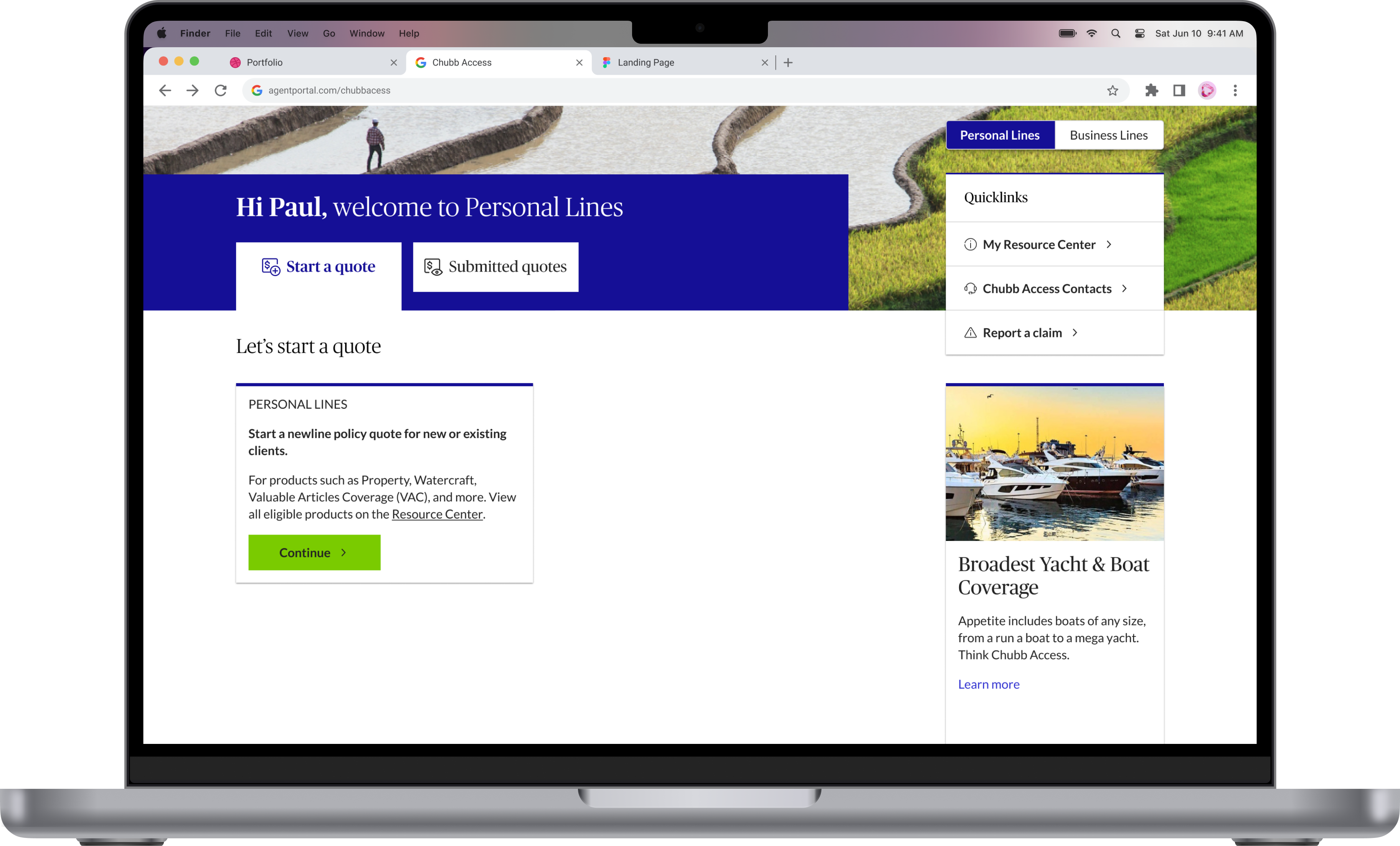
At Chubb, the largest casualty insurance firm, I was tasked with designing Chubb Access, a streamlined counterpart to the existing Agent Portal, specifically tailored for non-appointed agents.
This introductory platform, designed to seamlessly complement the comprehensive Agent Portal—a project I also contributed to—provides key tools and resources to facilitate their path to appointment.
Problem
Un-appointed agents have limited resources to service out their clients efficiently and effectively.
Stakeholders and Team
To bring Chubb Access to life, it required a collaborative effort from three distinct teams within the Chubb ecosystem, each responsible for different platforms. This meant I had to work closely with three different product owners: one for Chubb Access—the platform I was designing, another for the Agent Portal—the father to Chubb Access, and a third for Chubb Small Business.
Chubb Access
Product owner: Jeff Hoffman, Paul Morissette
UX Designer: Hayford Kesse, Erik Jacobsen
Project manager/Scrum: ShantanuLead Developer: Rajesh
VR Tech lead: Vithal RaoCustomer Experience (CX): Lizz Shpiner
.svg)
Agent Portal
Product owner: Rebecca Gough
UX designer: Erik Jacobsen
Project manager/Scrum: Shantanu Kelavkar
Lead Dev: Nelson Trujillo
Tech lead: Kartik
BA: Mani
CX: Lizz Shpiner
Chubb Small Business
Product owner: Tyler Jones
UX designer: Sean Gabay
Lead dev: Dhruva Pavani KakaTech lead: BA: Saranya Sriramulu
The process
Designing the portal was quite the adventure, not exactly a walk in the park. We tried sticking to this double diamond theory and lean approach from the get-go, focusing first on what the business really needed and what our users were telling us during those early discovery chats.
Now, all that groundwork was done before I even jumped on board. So, when it was my turn to dive in, I kicked things off with a brainstorming session, building on all the cool insights and groundwork my team had already laid down. It was like picking up the story mid-chapter and trying to add my own twist to it!
Below is a diagram I created that walks you through the process it took to develop Chubb Access.
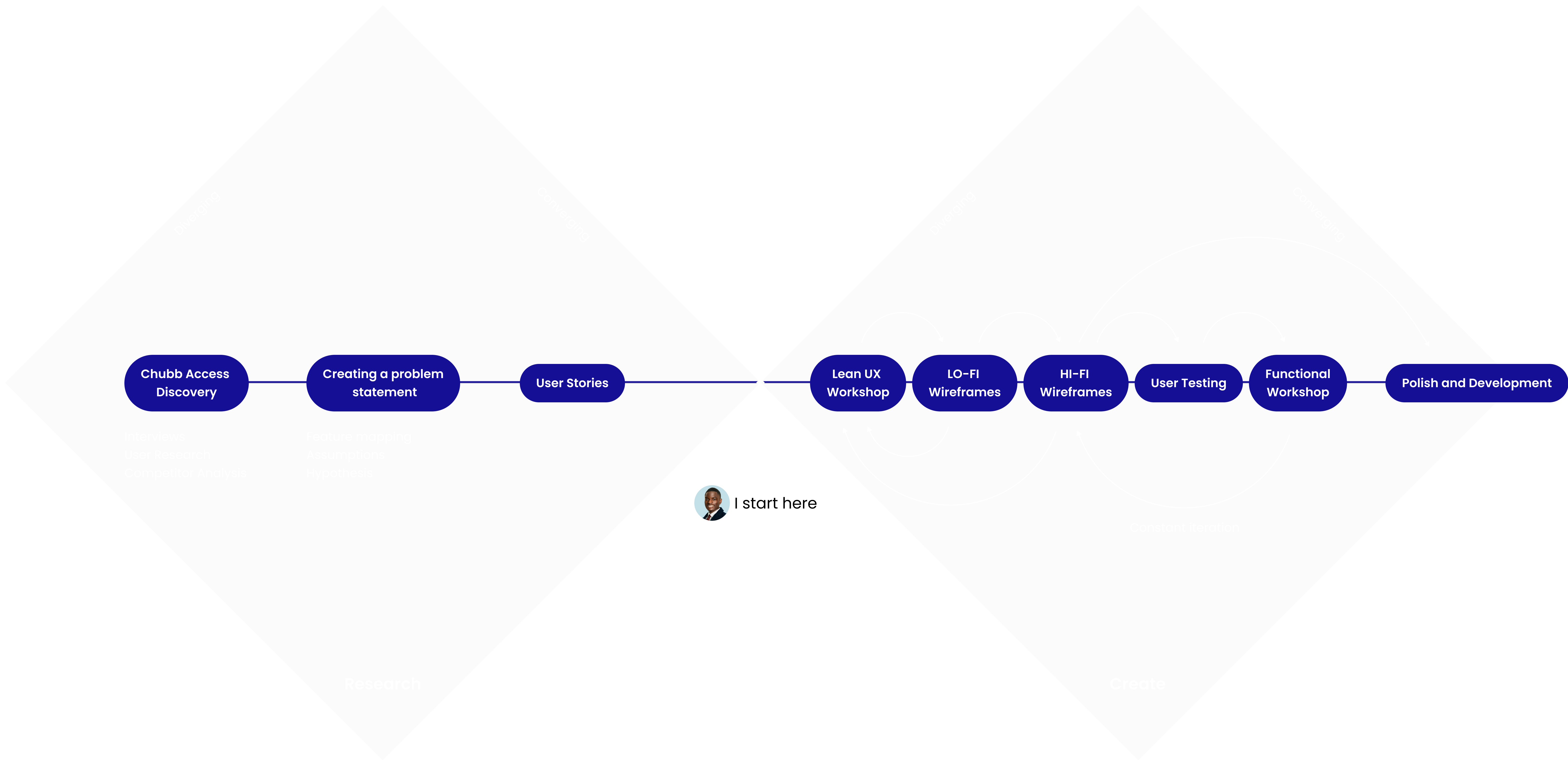
Brainstorming
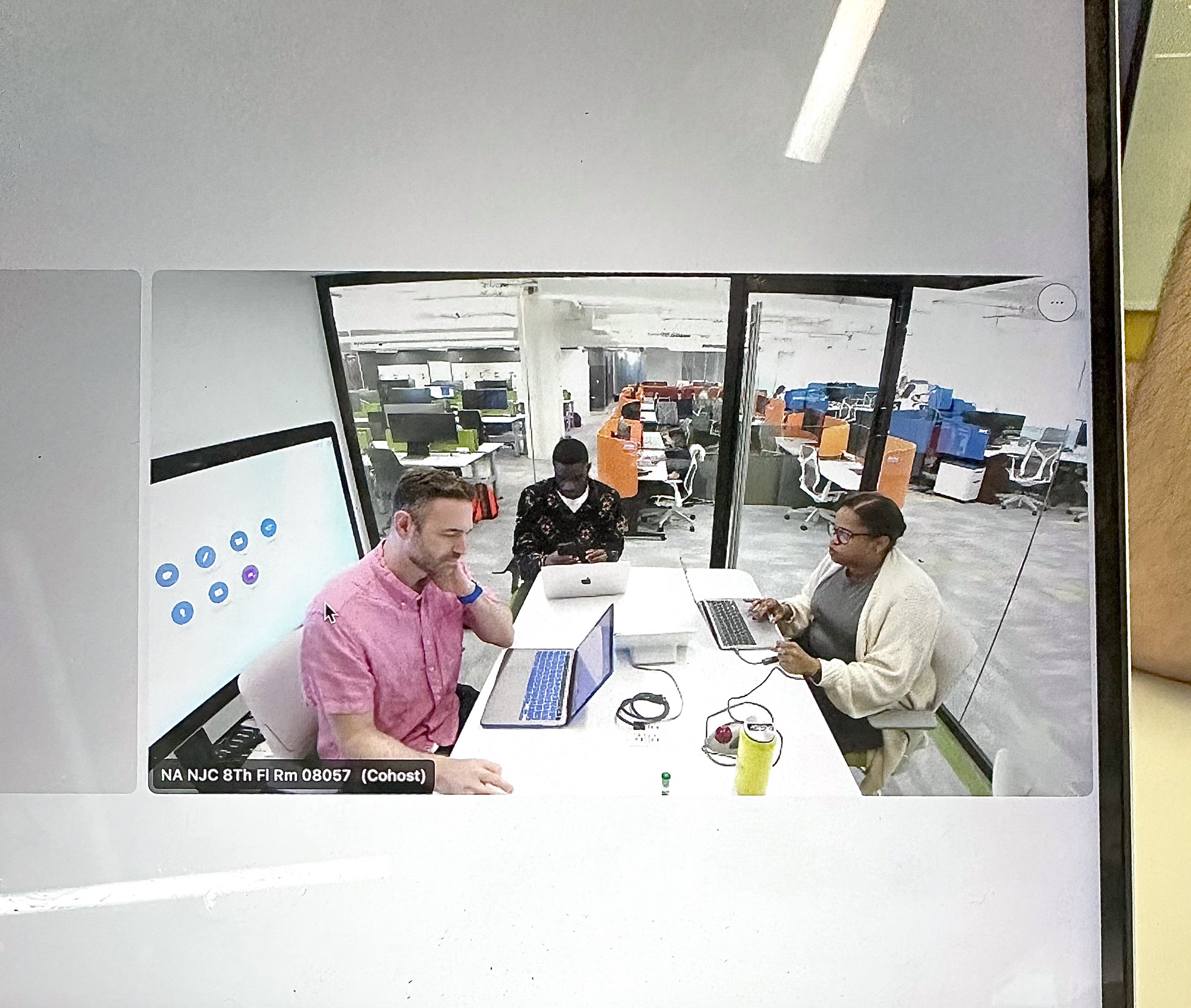
We had numerous meetings over the course of 2 week, with the Chubb Access Stakeholders to fully understand the project's goals. With numerous questions addressed by the informed stakeholders, I lead the prototype's design, under the guidance of Senior UX designer Eric Jacobsen, marking a crucial step in the platform's design process.
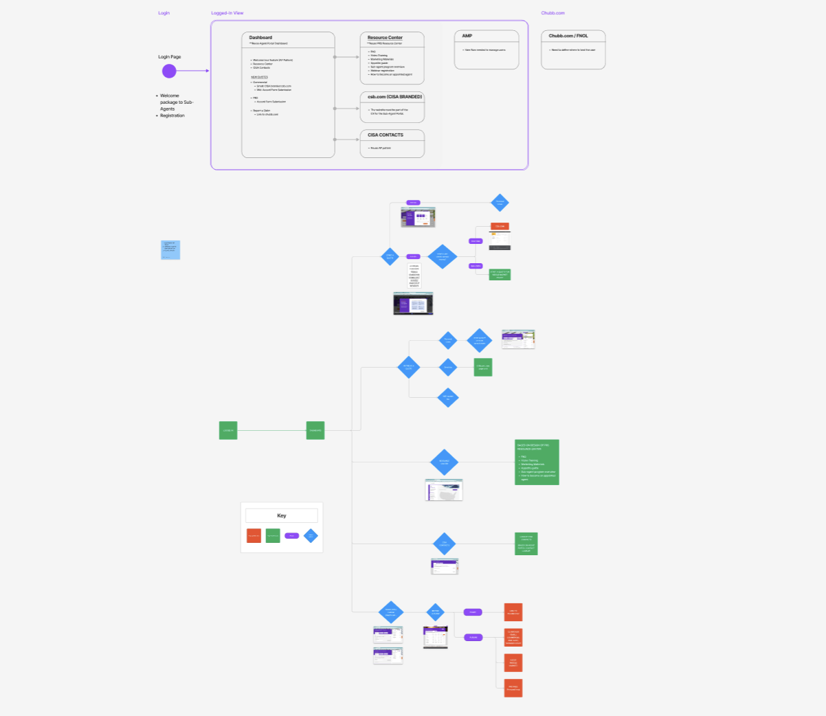
Information Architecture and User Flow
After clarifying the project's scope and objectives, we crafted the information architecture, a vital step to organize and structure the platform's content and navigation. This ensured a user-friendly and intuitive experience, making it straightforward for users to find information and navigate the platform efficiently.
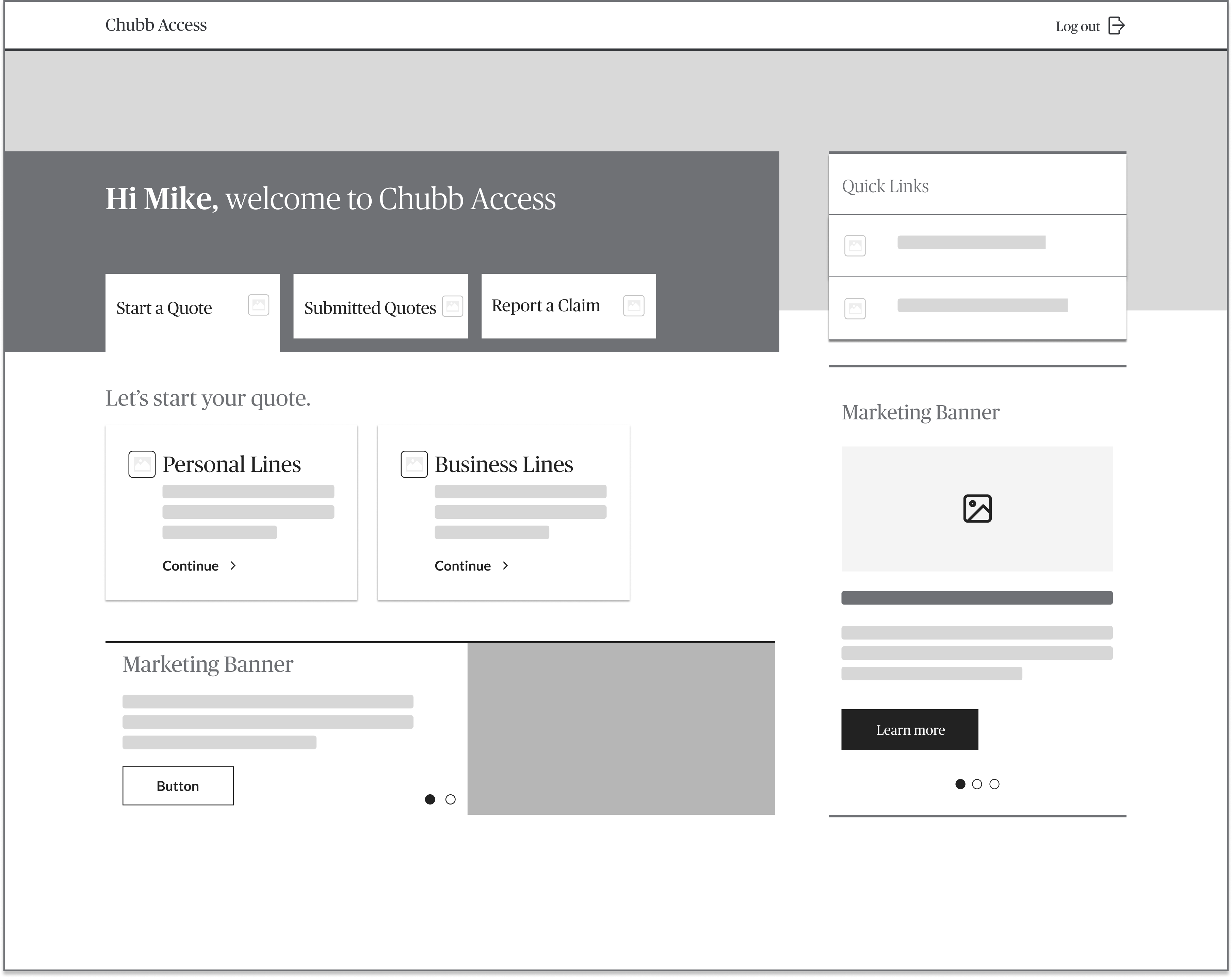
Low Fidelity Prototype
After finalizing the information architecture, I developed the initial low-fidelity (lo-fi) prototype, which evolved through seven iterations. Regular team meetings often resulted in revisions, continually refining the prototype to meet our goals and stakeholder needs.
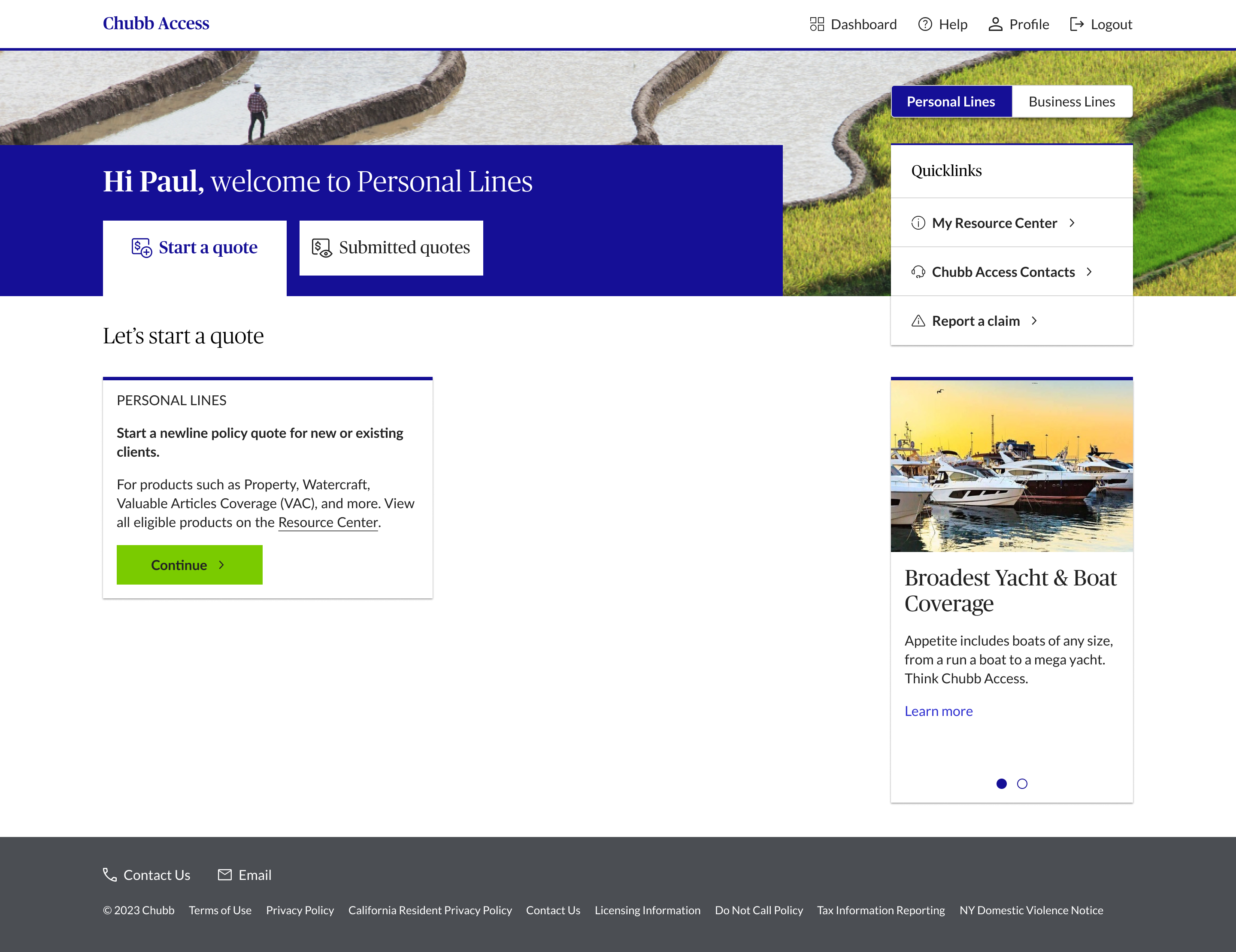
High-Fidelity Prototype
After countless loop of discussions, tweaking designs, and double-checking with our stakeholders to ensure we were hitting the mark on the business goals, not to mention making sure it our ideas were feasible with the dev team, we finally got to the point where it felt right to take our designs test with real users.

Usability Test and Corrections
I perfected the dial over three iterations, and its evolution is illustrated below. After finalizing and sharing it with the team, we were prepared for usability testing. Below is the presentation I prepared for stakeholders to discuss the test outcomes and to decide on the final solutions.
Developer handoff
I finalized the prototype and presented it to the developers, addressing all their questions and clarifying any concerns they had.
The messy part.
One of the biggest challenges we ran into was trying to balance the needs of different product owners. Each one had their own vision for their portal, which sometimes led to a bit of a tug-of-war over the direction we should take with Chubb Access. We had to find a way to make changes without throwing off the balance in the other portals, all while keeping a consistent look and feel. And then there were the headers – getting those to work right across all the different portals turned out to be a challenge that took too many meetings to solve.
Get's juicier
We had a bit of a standoff between Chubb Small Business and Chubb Access, each sporting a different header style. The debate was whether to unify the header under the Chubb Small Business style or adopt the one used by the Agent Portal. Each camp had their product owners passionately defending their turf and their header's design. After a lot of back-and-forth, we landed on siding with the Agent Portal's header style in the end. It was quite the discussion to get there, though!
Chubb Agent Portal Header

The Agent Portal is essentially a more advanced version of Chubb Access, designed with the vision that non-Chubb agents will start with Chubb Access and eventually graduate to the Agent Portal. This backdrop set the stage for our debate: should we maintain a consistent header style across the platforms, or stick with the unique small business header? The crux of the matter was that within Chubb Access, users might be redirected to Chubb Small Business. If the headers varied too much, it could disrupt the user experience, making them feel a bit lost and breaking the visual consistency we aimed for across the ecosystem.
Chubb Small Business Header

Chubb Small Business played a vital role in the creation of Chubb Access, because Chubb Access is where agents kick off and submit quotes for new insurance policies. And sometimes, these quotes are for small businesses, business making less than $30 million a year. When that happens, agents get redirected right to the Chubb Small Business portal, which holds its unique header. That's why the small business header became such a focal point in our talks.
Final Header Decision

In the end we decided to stick with the style of the agent portal logo because firstly the chubb small business header did not match the agent portal header. Legally we also could not brand chubb access as a chubb product, so we had to remove the chubb logo from the header.
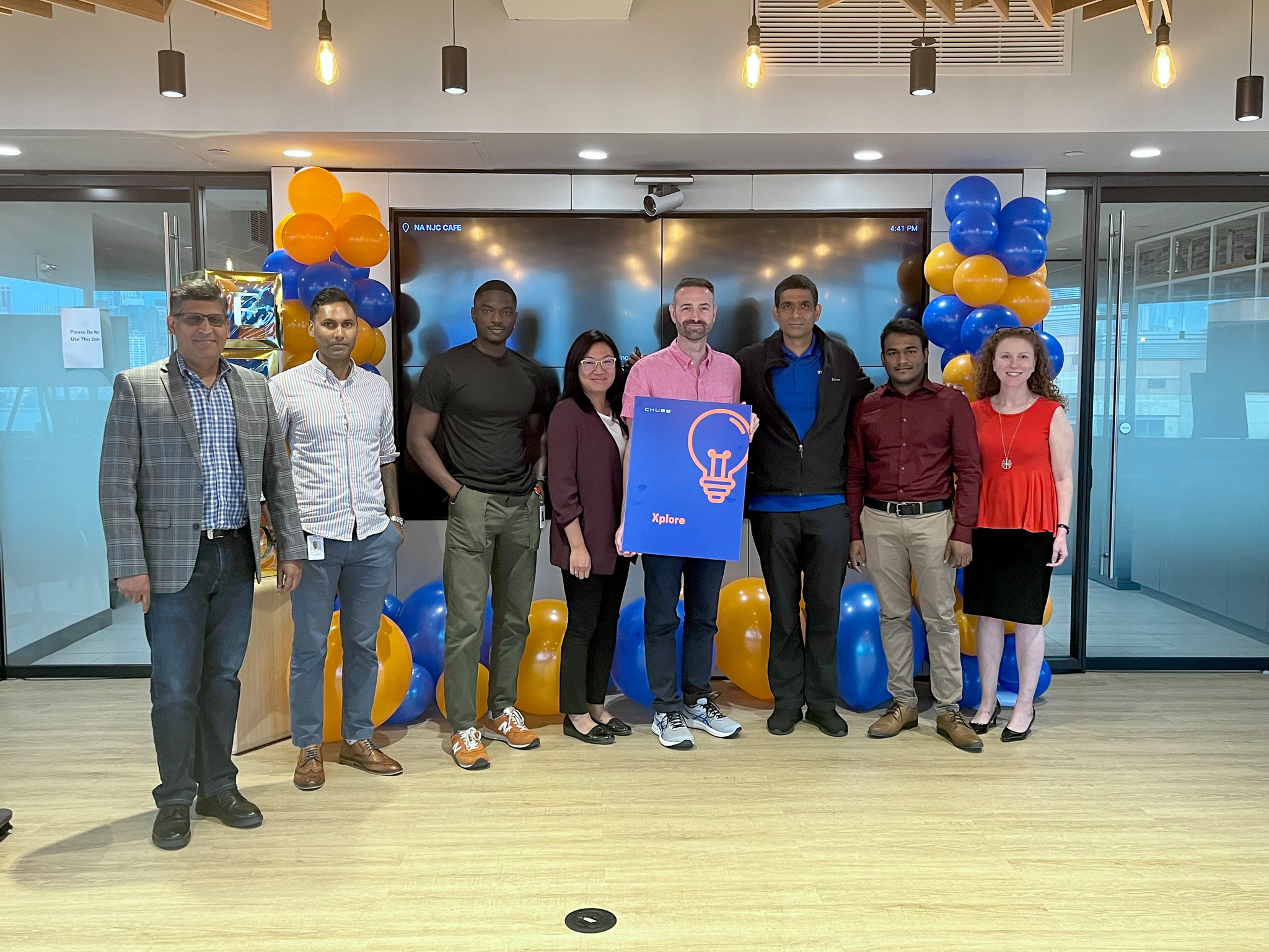
Working at Chubb
On the left is that explains the details on what I worked on during my amazing time at CHUBB. Feel free to interact with the deck below.
You can interact with the deck below. Use the left and right arrow keys on bottom right
Next Step
Set up channels for users to provide feedback, such as surveys, feedback forms, and direct communication lines.
Monitor social media and forums where users might discuss the software.
Next Step
Strategize long-term development plans based on market trends, user needs, and emerging technologies.
Next Step
Leveraging insights from our initial software, we plan to develop a new interactive platform tailored for advanced users. This next iteration will incorporate enhanced features and complex functionalities, specifically designed to meet the sophisticated needs of higher-level students, thereby elevating their learning experience with cutting-edge educational tools.
